KonoSuba typeface
KonoSuba (この素晴らしい世界に祝福を!) uses, for its isekai environment, a writing system constituting a modified roman alphabet. I am not the first person to work on the task of putting together a font for this; I have endeavoured to build upon / improve upon exisiting attempts where possible.
Obviously, this is entirely fanwork and without official endorsement or recognition.
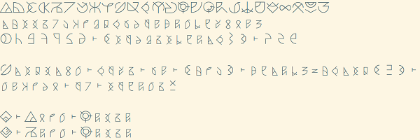
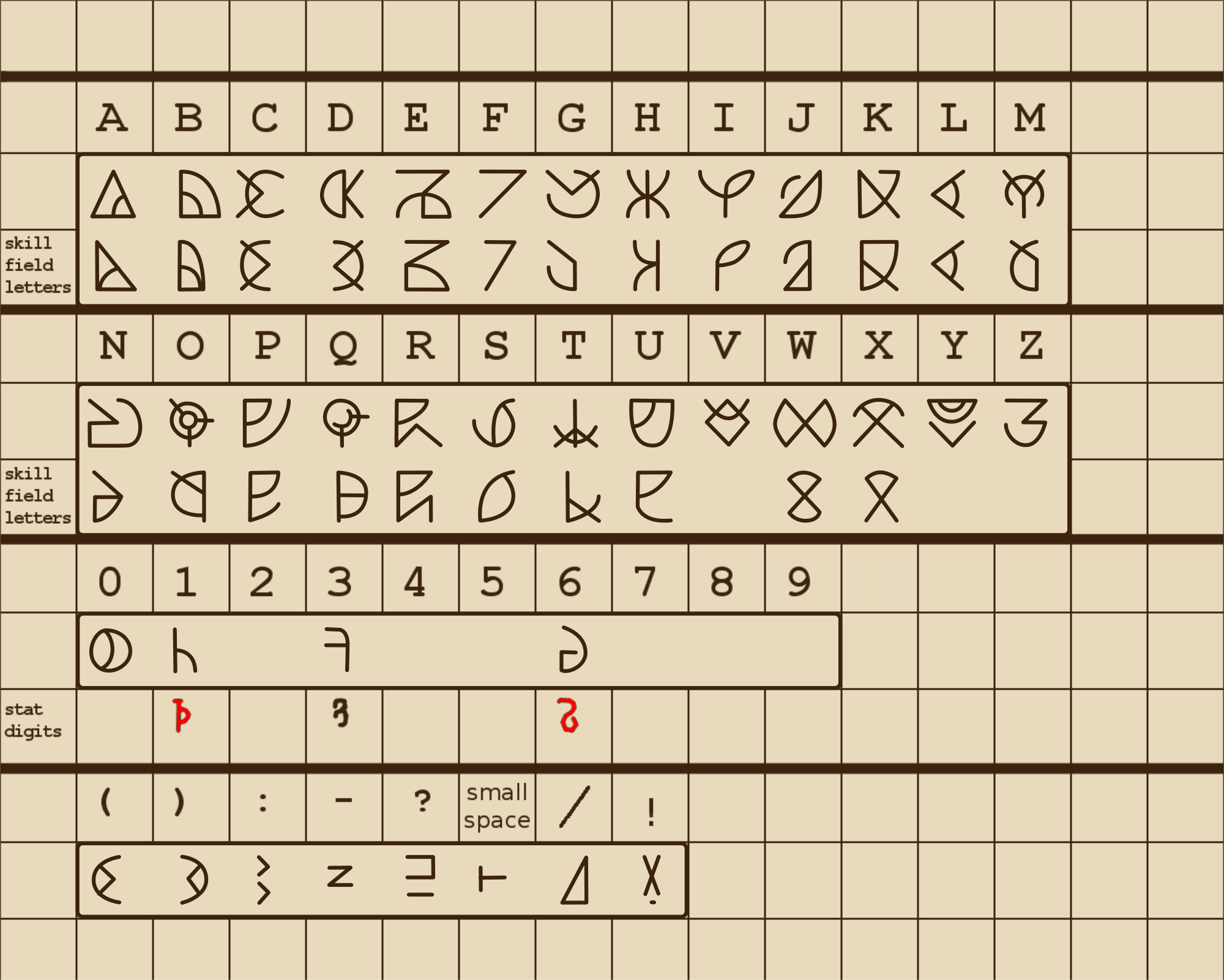
My “Konosuba 4” font. This was derived from “Konosuba 3” below. I added the digits (although 7, 8 and 9 are conjectural as they seem only to be known in calligraphic form) and adjusted some of the existing glyphs, mainly for horizontal size and positioning.
My older “Konosuba 3” font. This was derived from “Konosuba 2” below. I added the narrowcase glyphs (for lowercase letters) and some non-letter glyphs (notably Aqua’s Axcis sigil (for @) and Eris’ sigil (for $ or €)), and adjusted some of the existing glyphs.
My older “Konosuba 2” font. I used /u/-Alexor-’s font to create a very high-resolution image showing all of its glyphs, which I mechanically retraced and in some cases further adjusted. I also added several more established punctuation marks, and lowercase as a scaled down uppercase.
Sources
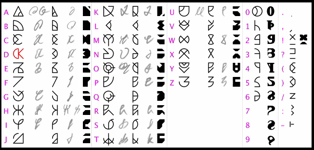
/u/-Alexor- made an older version. That version provided only uppercase letters, word separator and hyphen and had some flaws. Its font name is “SVGfont”. Automatic traces of images rendered from this font were the original basis from which I derived my version.
Mirror: Konosuba-Alexor.ttf.
I referenced this and this (neither mine) in adding the remaining glyphs, although I did not trace from them.

